4638
#1

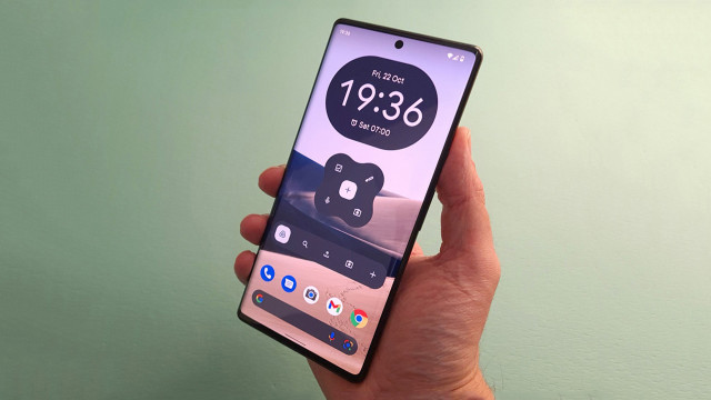
Gần đây với Windows 10 cho điện thoại, Microsoft đã giới thiệu thành phần giao diện mới là menu dạng "Hamburger". Dĩ nhiên nếu ai đã dùng các nền tảng khác thì loại Menu này không có gì quá mới lạ, thậm chí còn được dùng khá phổ biến trên các ứng dụng của iOS hay Android.
Vậy tại sao trước đây Microsoft không dùng loại Menu này trên Windows Phone 8 nhưng lại áp dụng trên Windows 10? Câu trả lời đã đến trong một chuyên mục AMA (Hỏi tôi bất kỳ điều gì) trên Reddit từ một cựu nhân viên của hãng. Vị cựu nhân viên này cho biết mình là trưởng nhóm thiết kế trước đây của ứng dụng Office trên Windows Phone nhưng đã nghỉ việc một năm trước đó.

Menu Hamburger là xu hướng thiết kế
Nội dung của AMA khá dài nhưng rất thú vị, tóm tắt lại thì các nghiên cứu trong nội bộ đã đem đến quyết định quan trọng trong việc sử dụng loại Menu này
- Người dùng không phải lúc nào cũng sử dụng điện thoại với một tay như chúng ta nghĩ, đặc biệt là các thiết bị màn hình lớn càng khó khăn hơn
- Họ đã khám phá mô hình thiết kế thay thế nhưng có vẻ không đem lại hiệu quả. Nói cách khác, đi theo xu hướng Windows trên máy tính để bàn và các nền tảng khác của thế giới đem lại lợi ích tốt hơn là tạo ra thiết kế khác biệt.
Các bạn nghĩ sao về Menu Hamburger? Hãy cho mọi người cùng biết.
"Ah yes, the hamburger. So. I've written so much about this (and even made videos) that I'll do my best to summarize."
"Windows Phone's original interaction model put actions on the bottom and navigation on the sides, as swipes. That's not a great pattern for a variety of reasons."
"iOS started with a lot of apps using tabs on the bottom, and over time started aligning more with Android, who put a few key actions on the top, then a "swipe back" pattern for more options. Think of Mail on iOS, how you go into a message, then you can swipe from the left to get back to your inbox."
"Windows Phone was left in an interesting spot. Many of us believed that the old interaction model just wasn't going to work. You can't stick navigation in a horizontal direction. It's part carousel, part "mystery meat navigation" and it just doesn't work. So. We needed to figure out what the new model would be."
"Putting a title bar on the top was the first important step. If you're in Word and you can't see the name of your document, that's not good. So, ok, put a bar across the top. And now you have a bar across the top you can provide a back arrow in the top left to get back to your documents. Awesome."
"Then you put the ribbon in what I called a "palette" or "drawer" on the bottom, and on the top right you can start putting "hero actions." I argued for only one but I'm unsurprised that they ended up with more."
"So there you go, right?"
"Top: <-- Name of document common actions"
"Bottom: Three dots to get the ribbon in palette form."
"The problem is, there's just way too many things on the top bar. For example, you might want to print. How do you do it? Well, you could design a print icon in the top bar. But it's probably not worth it. You could hide it in the ribbon, but that sort of sucks for discoverability."
"And then you notice the top left corner. And you think "Well, tons of Android apps just put everything there. Maybe we could try that?"
"And so it became clear, due to the massive number of features in Office apps, and the extremely tight real estate, and alignment with tablets, that a hamburger was the best overall pattern."